Some blog posts get attention, but lose readers before they take the next step. People click, skim a few lines, scroll a little, and leave. That usually happens when the topic feels dense, technical, or packed with too much information at once.
This is where 2D animation infographics can help. They make complex ideas easier to see, easier to follow, and easier to understand quickly.
In a content upgrade funnel, that matters because the right visual can turn a passing reader into someone who actually wants to keep going.
What a Content Upgrade Funnel Looks Like in a Real Marketing Strategy
A content upgrade works best when it feels like a natural next step, not a random freebie under a blog post.
Someone lands on an article to figure something out, reads enough to care, then sees a visual download, short animated explainer, or infographic that helps them understand the same idea faster.
In a real marketing strategy, the flow can stay simple. The article earns attention, the upgrade gives one clear next move, and the follow-up email keeps the conversation going. Relevance matters more than volume, and presentation matters too.
Maintaining consistent branding through color palettes and typography is important for professional infographics, because it helps the content feel clearer, stronger, and more aligned with the brand.
Read the Article: Here’s What You Need to Know About an Interactive Infographic
Why 2D Animation Infographics Work for Complex Information
Some ideas are harder to explain in plain text.
A product workflow. A campaign system. A set of numbers that only makes sense when you see the pattern. This is where 2D animation infographics help.
2D infographic videos are highly engaging and ideal for social media platforms where users scroll rapidly.
They are also highly engaging, which makes them a strong fit for social media platforms where people scroll quickly. Well-designed infographics make information easier to remember, adding long-term value to marketing efforts.
Types and Applications of 2D Infographics
Not all 2D infographics do the same job. Some are built to explain numbers. Some help people follow a process. Others make comparisons easier to understand. That is why it helps to separate the type of infographic from the way it is used.
Common Types of 2D Infographics
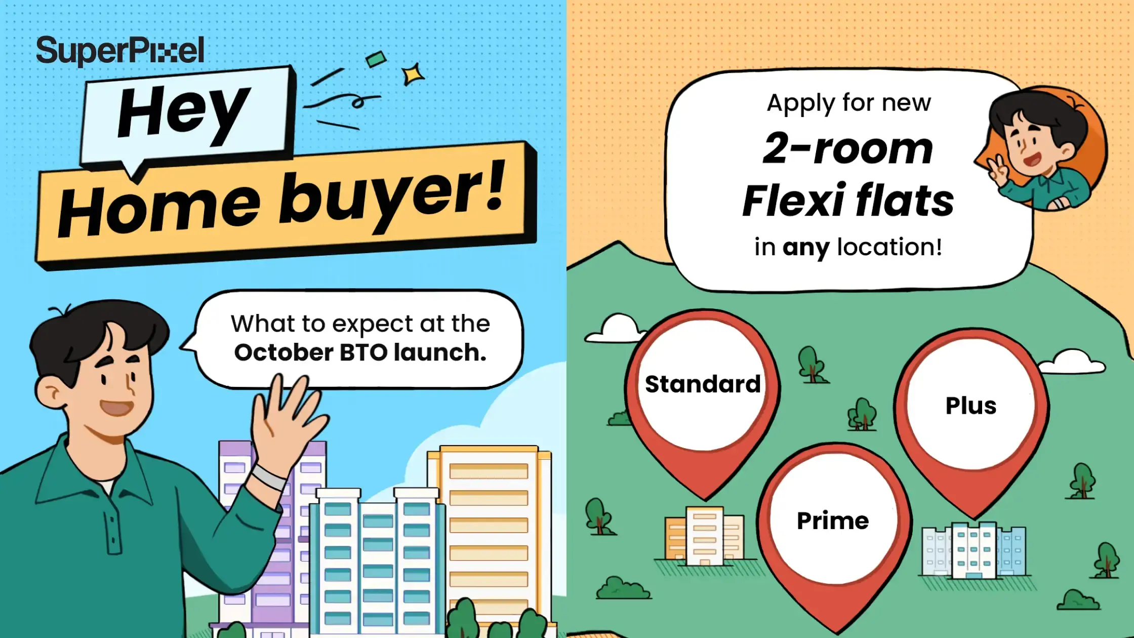
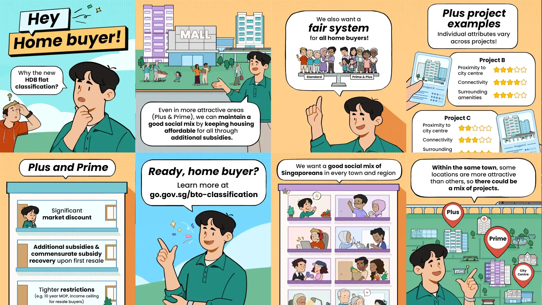
Different types of 2D infographics include statistical, timeline, process, comparison, and informational infographics.
- Statistical infographics present data and numbers in a visually appealing way, often using charts and graphs.
- Timeline infographics show events or processes in chronological order, making it easy for viewers to follow the flow of events.
- Process infographics explain how something works in step-by-step detail, ideal for demonstrating workflows or product assembly.
- Comparison infographics allow for side-by-side evaluation of two or more options, helping audiences make better decisions.
- Informational infographics break down and explain key concepts, combining visuals with short text sections for clarity.
Explore More: 8 Animated Infographic Videos Benefits For Content Marketing Strategy
How 2D Infographics Help People Understand Information
Once the type is clear, the next question is why the format works so well in the first place.
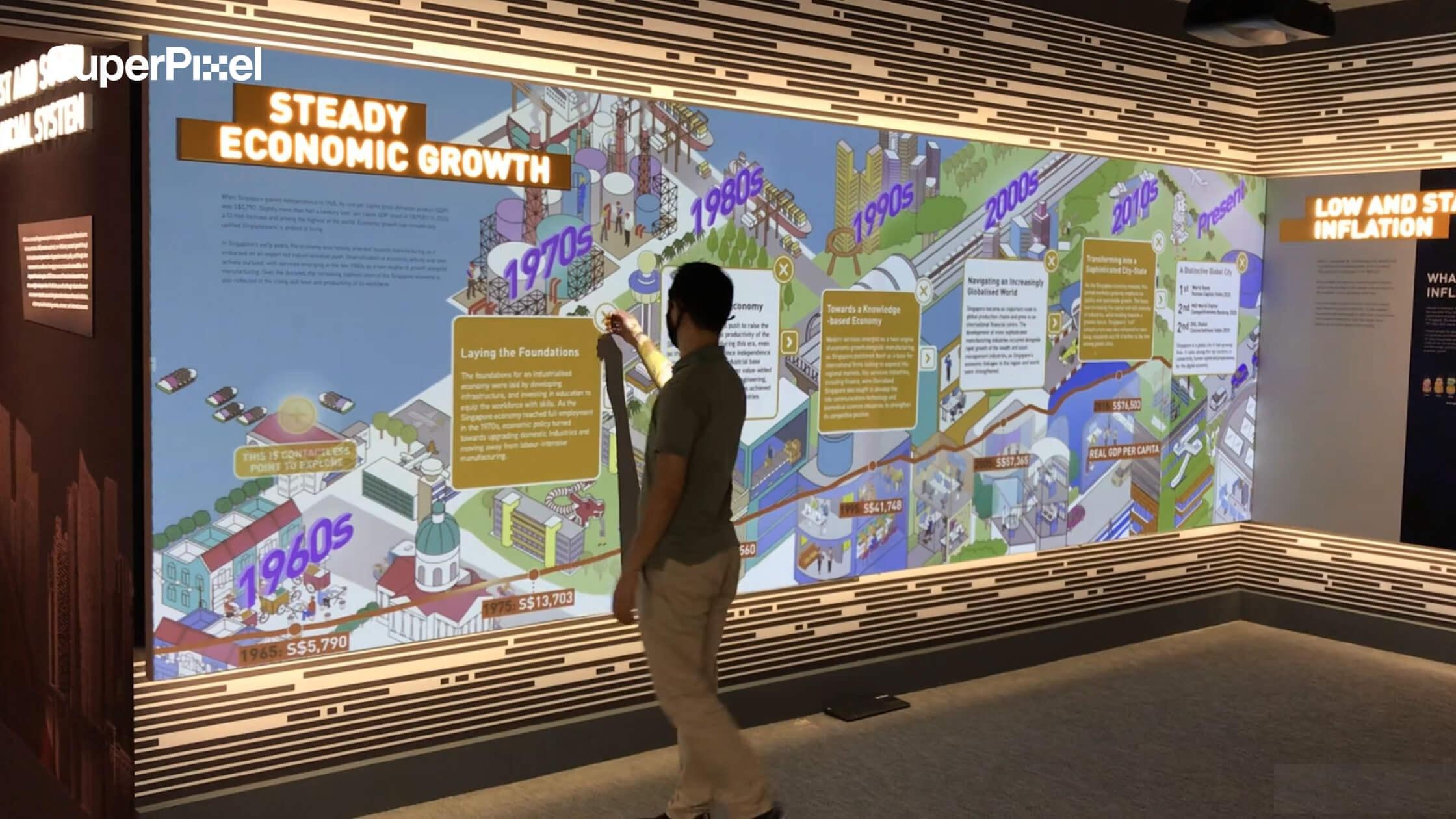
Using visual metaphors can make complex data more intuitive for the audience. Visual hierarchy can highlight critical data points in animated infographics.
2D infographics simplify complex data by turning it into engaging visuals. They enhance visual storytelling by guiding the audience through information using elements like charts and diagrams.
Where 2D Infographics Are Commonly Used
That is part of why 2D infographics show up in so many places.
2D infographics are commonly used in marketing, education, and reports to communicate key messages effectively. 2D infographics are effective in boosting engagement on social media due to their visually appealing nature.
When you know which type you are using and where it will appear, it becomes much easier to decide what the viewer should notice first, what they should do next, and how the story should be presented.
Read More: How a Creative Video Production Company Can Support Your Business
Simplifying Complex Information with 2D Infographics
Some topics lose people fast. Too many steps. Too many numbers. Too much context in one place.
This is where 2D infographics help. They break complex ideas into smaller, easier parts. They make information clearer, more visual, and easier to follow.
Clear data visualization, readable fonts, and enough white space also help key points stand out, so the message feels easier to absorb.
The goal is not just to make things look better. The goal is to make them easier to understand. Consistent colors, fonts, and style help create visual cohesion, which makes the content feel clearer from start to finish.
Visual storytelling helps with that. It gives the audience a clear path to follow and keeps them engaged for longer.
Motion graphics, character-based storytelling, and kinetic typography can all support that flow by adding emphasis where it matters most.
This matters even more when the topic feels dry or technical. A simple visual can make the message easier to grasp in seconds. It also helps when the information is revealed gradually instead of all at once. That kind of progressive disclosure keeps viewers from feeling overwhelmed.
Animated characters can make abstract ideas feel more relatable. Moving charts or data reveals can also make change easier to see.
Colors, pacing, and visual elements can even add emotion, which helps the message feel more human and easier to remember.
That is why 2D infographics work so well in marketing content, reports, videos, and website content.
If the blog post explains the idea, the infographic helps people see it faster. And when the visual is well designed, it can also encourage more interaction and sharing across digital platforms.
Animated Infographics vs Static Content
Static visuals still work. Sometimes they are the best choice. If the reader just needs a quick reference, a clean static graphic may be enough.
But animated infographics do more when the idea depends on order, change, timing, or cause and effect. They show what happens first. Then what happens next. Then what happens because of it.
That makes them useful for product explainers, process breakdowns, campaign recaps, and data visualization that needs motion to make sense.
How AI Search Changes the Way People Find and Trust Content
AI Search is also raising the bar for clarity. Content that is easier to scan, easier to remember, and easier to understand has a better chance of staying useful across different discovery paths.
Well-designed infographics help by using clear data visualization, readable fonts, strong hierarchy, and enough white space to make key points stand out. Progressive disclosure also helps by revealing information step by step instead of overwhelming the viewer all at once.
That matters for brands creating animated infographics. High-quality visual content can support discoverability, encourage more interaction and sharing, and give the audience a clearer path through the information.
When the structure is strong and the message is easy to follow, the content becomes more helpful for both readers and modern search experiences.
Final Thoughts on Using 2D Animation Infographics in a Content Upgrade Funnel
A good blog post can get attention, but a strong content upgrade gives that attention somewhere to go.
That is why 2D animation infographics work so well for brands dealing with complex information. They make the message easier to grasp, easier to remember, and easier to act on.
If your team wants to turn dense ideas into visual content that supports both the story and the funnel, SuperPixel can help.
Explore our work or get in touch to see how we can shape your next infographic into something clear, useful, and built for real marketing results.
FAQ
What are 2D animation infographics?
They are simple visual explainers that use motion to make information easier to understand. If a topic feels too dense in text, this format helps people follow it faster.
How are animated infographics different from static infographics?
Static infographics are good for a quick overview. Animated infographics are better when you need to show flow, change, or steps in order.
When should a brand use 2D animation infographics?
Use them when the message is important but hard to explain quickly. They work well for products, reports, campaigns, and anything with complex information.
Are 2D animation infographics useful for B2B marketing?
Yes. In B2B, people often need help understanding a process, service, or value clearly. This format makes that easier without overloading them.
How do I know if my content needs an animated infographic?
A simple sign is this: if people need extra explanation every time you present it, it probably needs a better visual format. That is usually where an animated infographic helps.