An interactive infographic isn’t just a prettier chart. It’s a shift in how teams present information.
Instead of forcing audiences to read linearly, an interactive graphic invites them to explore then to click, scroll, filter, and reveal complex data at their own pace.
That small shift changes everything. Because when audiences control the journey, attention lasts longer. And when attention lasts longer, understanding deepens.
Let’s unpack what makes an interactive infographic powerful and how to design one that earns its place in your marketing stack.
What Is an Interactive Graphic in Today’s Interactive Content Landscape?
At its core, an interactive infographic is a visual representation of information that responds to user input.
Unlike static content, it requires action. Clicking. Hovering. Scrolling. Zooming.
Traditional infographics are typically static images while interactive graphic s are web-based and often include elements like pop-up windows and videos.
That difference is more than technical. It’s experiential. Best infographics are infused with interactive elements that allow readers to engage with the content to trigger an action.
This could be as simple as hover-over labels on bar charts or as complex as filtering thousands of data points in a dynamic content dashboard.
And in a world overloaded with complex information, that responsiveness matters.
Create Interactive Content as Evolution, Not Replacement
Traditional infographics are best for straightforward storytelling, whereas interactive versions can manage larger, complex datasets by revealing information layer-by-layer.
That’s the key. An interactive infographic doesn’t replace a static design. It extends it.
Where static infographics present information in one view, interactive content allows progressive disclosure by showing detailed information only when the reader scrolls or chooses to engage.
Interactive infographics help simplify complex information, making it easier for audiences to understand. And when designed well, they feel intuitive at first glance.
Why Interactive Infographics Increase Engagement (and Dwell Time)
Interactive infographics increase engagement by encouraging active participation from the audience. They transform passive reading into active exploration.
And that changes dwell time.
From Passive Viewing to Active Participation
Interactive infographics allow users to engage with content actively rather than passively consuming it. When someone clicks to reveal statistics or filters a data visualization to compare results, they invest effort.
Interactive infographics allow users to engage with content at their own pace, enhancing comprehension.
Engagement Metrics That Matter
Interactive infographics are shared 37% more than static content, increasing their reach. Interactive infographics can improve brand awareness by making content more appealing and engaging.
And when embedded properly, they help increase dwell time and boost SEO because readers don’t bounce in seconds.
AI Powered Search Insights: What Data Says About Interactive Infographics
Before diving deeper into craft, it’s worth looking at how interactive infographic performance is showing up in search-driven analysis.
From an animator’s lens, these aren’t just statistics. They’re signals about how audiences behave and what design choices move the needle. Below is the data, exactly as surfaced:
Performance & Reach (views, effectiveness, shares)
From an animator’s lens, this cluster is about why interactive infographic formats outperform static content. These numbers justify the extra production effort, in content marketing where visibility and retention drive ROI.
Interactive infographics achieve 45% higher effectiveness than static articles when engaging audiences.
Content with interactivity sees a 90% increase in views compared to traditional content. The infographics are shared 37% more than static content, increasing their reach.
Interactive infographics can improve brand awareness by making content more appealing and engaging. Creating infographics increases audience engagement by turning passive viewing into an active, personalized experience.
Interactive infographics increase engagement by encouraging active participation from the audience. The infographics allow users to engage with content actively rather than passively consuming it.
SEO & Distribution (embed, dwell time, sharing links)
Interactive infographics are not just design assets. They’re SEO assets when embedded strategically on a site.
Interactive infographics can be embedded in blog posts to increase dwell time and boost SEO.
Users can track engagement metrics for their interactive infographics to measure effectiveness. Testing and optimizing the infographic before publishing is crucial to ensure all elements function as intended.
Interactive infographics can be used in various fields such as marketing, education, and journalism to enhance engagement and understanding.
Story & UX Patterns (narrative arc, progressive disclosure, scrollytelling)
To guide the reader, a narrative structure featuring a story arc with an introduction, body, and conclusion should be defined in interactive infographics. Progressive disclosure is a technique used in infographics to reveal detailed information only when the user chooses to engage.
Scrollytelling is a technique that uses scrolling as a trigger to animate transitions or change visual content in infographics. Incorporating multimedia elements like audio and video can enhance the storytelling aspect of interactive infographics.
Traditional infographics are best for straightforward storytelling, whereas interactive versions can manage larger, complex datasets by revealing information layer-by-layer.
Traditional infographics are typically static images while infographics are web-based and often include elements like pop-up windows and videos.
In 2026, effective infographics focus on a single core message to ensure clarity and avoid clutter. Designing interactive infographics involves defining clear goals and understanding the target audience’s needs.
The layout of an interactive infographic should be designed to present data in a way that is easy for the audience to consume. The design of infographics should prioritize visual appeal to effectively convey the intended message.
Creating line graphs can help present complex data in a more engaging way. A data infographic is a visual representation of statistics and numerical information, useful for reporting and decision-making.
A comparison infographic juxtaposes two subjects to highlight their similarities and differences, making it valuable for side-by-side comparisons. Diagrams in interactive infographics break down complex topics using icons, shapes, arrows, and pie charts.
Interactive map infographics present geographic data in a visual format that is user-friendly and accessible. Creative infographics can represent any kind of data or information in a graphical format, including visual resumes and recipe cards.
Great Interactive Infographic Designs
Interactive infographic designs are rarely solo efforts.
They sit at the intersection of:
- Graphic designer (visual clarity, hierarchy, illustrations)
- Animator (motion pacing, transitions)
- Developer (logic, performance, responsive behavior)
Designing interactive infographics involves defining clear goals and understanding the target audience’s needs.
Before a single line of code is written, the team should define:
- What complex data needs simplification?
- What is the single core message?
- What does the audience need to discover?
Trade-Offs to Consider
Interactive visuals require development time. They demand performance optimization. Accessibility must be considered.
An overloaded interactive infographic with too many clickable elements can slow load speed and dilute the key message.
In 2026, effective infographics focus on a single core message to ensure clarity and avoid clutter. That principle applies here too.
Data Visualization: Presenting Complex Data Without Overwhelm
Data visualization is where interactive infographics shine.
A data infographic is a visual representation of statistics and numerical information, useful for reporting and decision-making.
Instead of dumping spreadsheets into static content, interactive visuals can:
- Animate bar charts on hover
- Filter timelines by year
- Compare statistics dynamically
- Reveal map data region-by-region
Interactive map infographics present geographic data in a visual format that is user-friendly and accessible.
Diagrams in interactive infographics break down complex topics using icons, shapes, arrows, and charts.
And when the reader scrolls, transitions guide the eye naturally.
This is scrollytelling, a technique that uses scrolling as a trigger to animate transitions or change visual content in infographics.

Tools & Platforms: Great Infographic Maker Options
Not every interactive infographic requires custom development.
Several platforms offer structured ways to start creating interactive content.
1. Genially (Free Templates & Animated Infographics)
Genially is a platform well-suited for creating animated, interactive infographics with clickable hotspots.
Genially’s interactive infographic maker allows users to create infographics for free.
It’s useful for teams testing infographic designs before committing to deeper builds.
2. Infogram
Infogram is a user-friendly platform for creating interactive infographics.
Strong for data-heavy presentation dashboards and quick-turn reporting.
3. Ceros
Ceros provides a platform for designing interactive infographics that can include multimedia elements.
More robust. Often used by enterprise marketing teams.
4. ThingLink
ThingLink offers tools for creating interactive content that can enhance visual storytelling.
Great for adding hotspots to images and embedding dynamic content.
Most of these tools include templates and free templates to accelerate production for teams experimenting with their first interactive infographic.
Interactive Infographic Examples
1. Immersive Product Storytelling for a Tech Launch
Some products are hard to “get” in a busy showroom when the innovation is inside the system. That’s where 3D anamorphic shines. It turns specs into a moment people stop for.
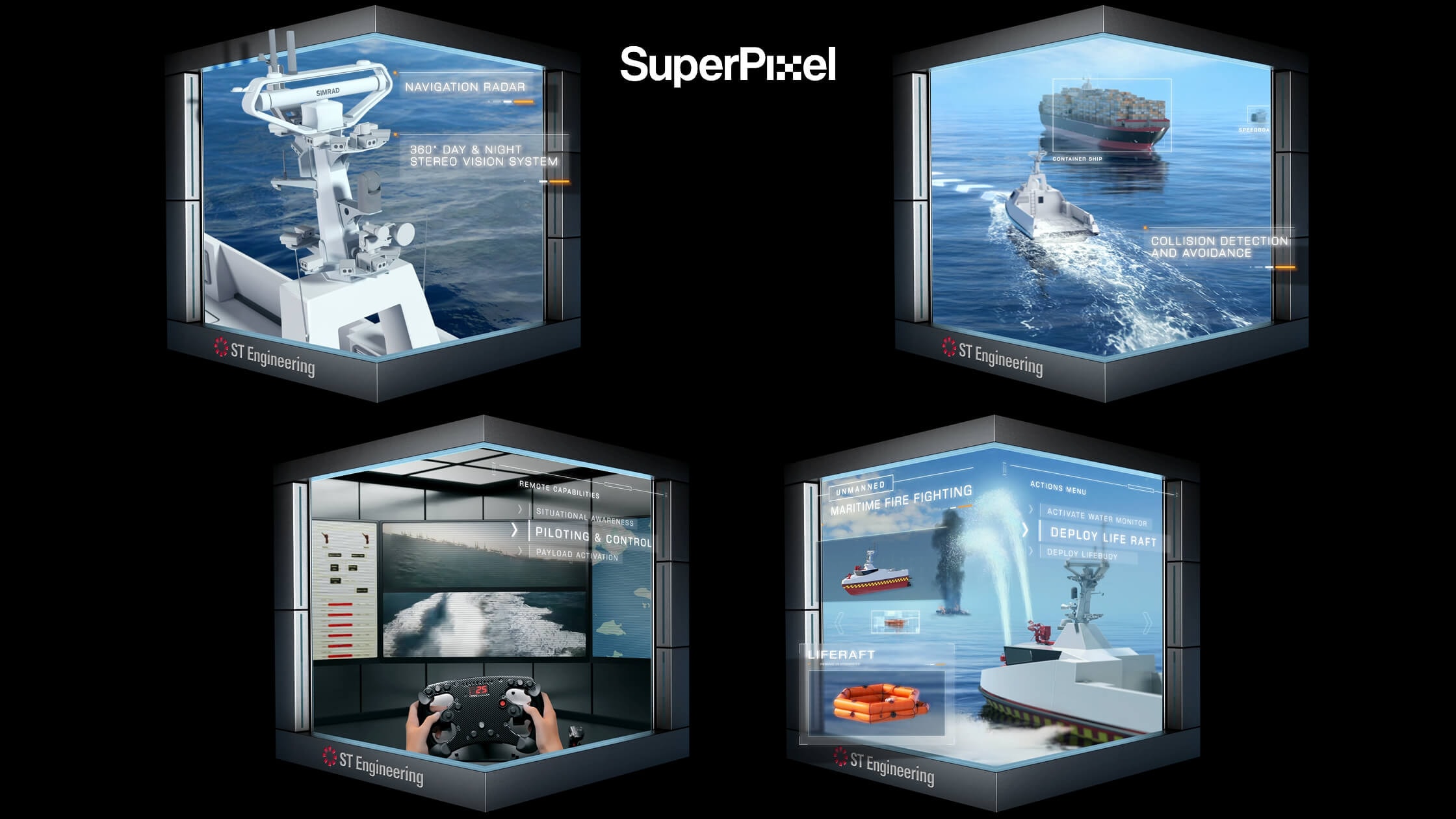
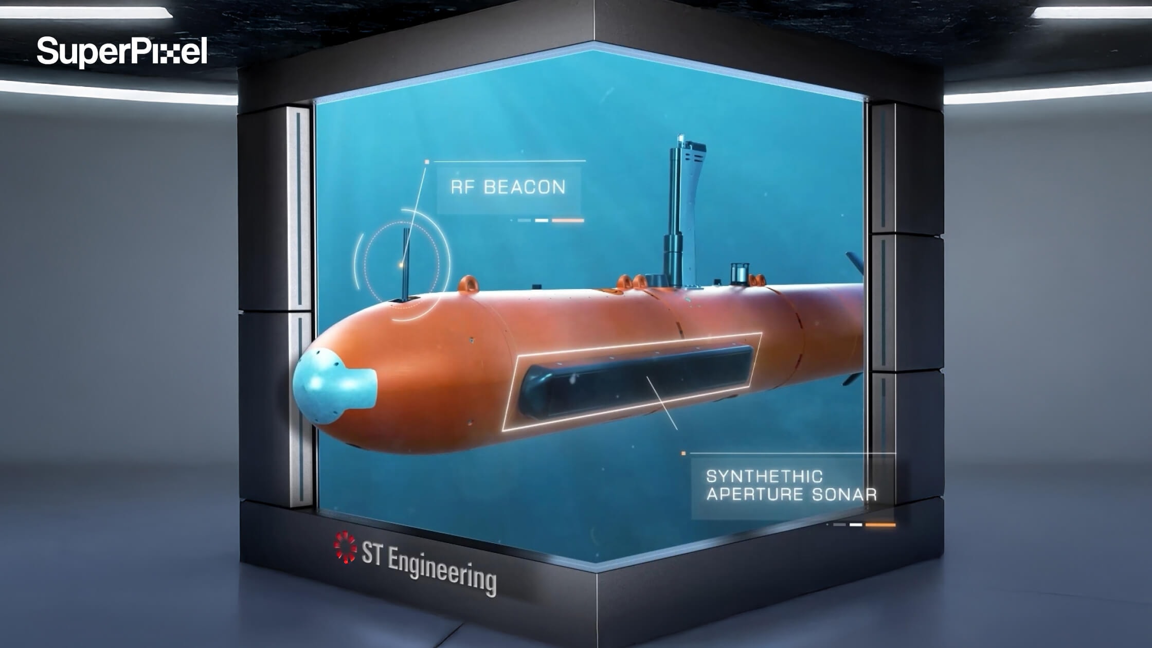
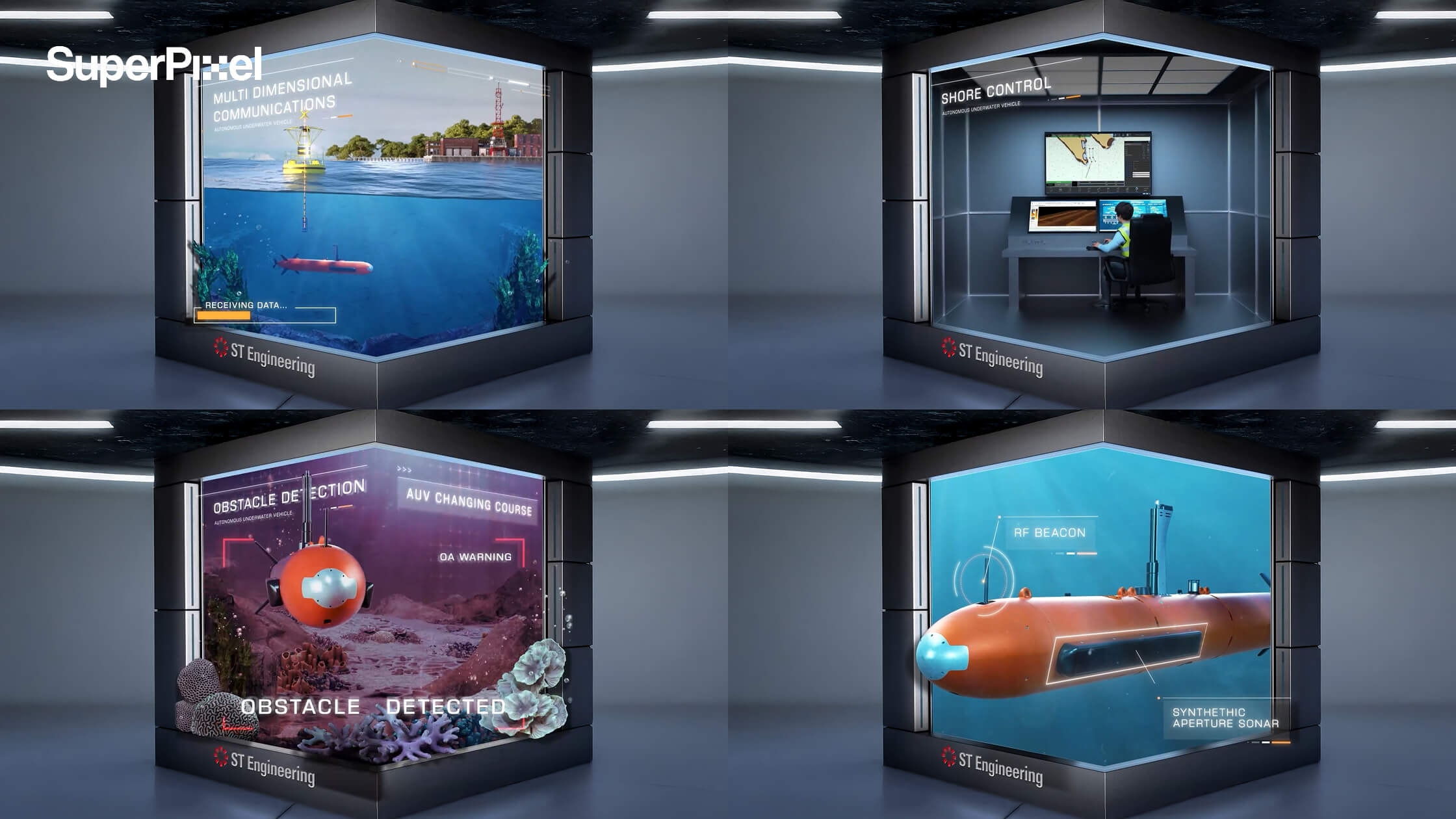
ST Engineering – Unmanned & Integrated Systems USV
For ST Engineering’s Unmanned & Integrated Systems launch, SuperPixel created a 45-second 3D anamorphic video displayed at their MANTA Gallery, designed to look like the USV is popping out of the screen through precise perspective and a clean, lab-like frame.
The video spotlights key capabilities like smart navigation, radar, autopilot, and AI-driven features, brought to life with realistic textures, dynamic lighting, and motion details (yes, even water) to make the tech feel cinematic, clear, and genuinely impressive even if viewers only glance for a few seconds.
2. Spread Awareness About a Specific Subject
Animated infographic videos are also highly effective for public education and awareness campaigns.
Some topics particularly healthcare or policy issues, can feel abstract or difficult to visualise. Animation helps translate invisible processes into something viewers can clearly see and understand.
National Healthcare Group | Hypertension Awareness
For this project, SuperPixel created an animated infographic to raise awareness about hypertension.
Using character-driven storytelling, the video visualises:
- What happens inside the body
- How high blood pressure affects health
- What preventive steps can be taken
The use of animated characters makes the biological processes relatable and easier to follow. Complex medical information becomes human, practical, and memorable.
3. Make Complex City Planning Easy to Understand
Interactive and immersive experiences are powerful for public education and awareness.
Topics like urban planning, transport, and sustainability can feel abstract and hard to visualise. But when people can play with the choices and see the outcomes, the message becomes clear, personal, and memorable.
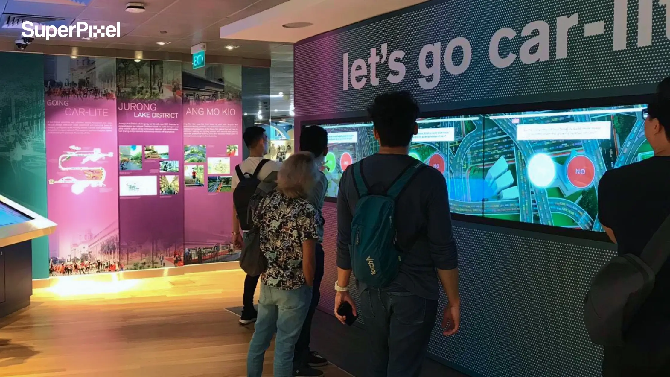
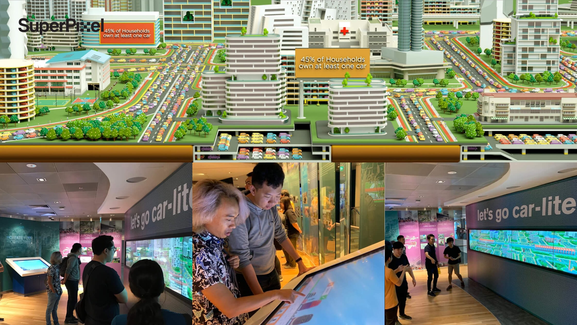
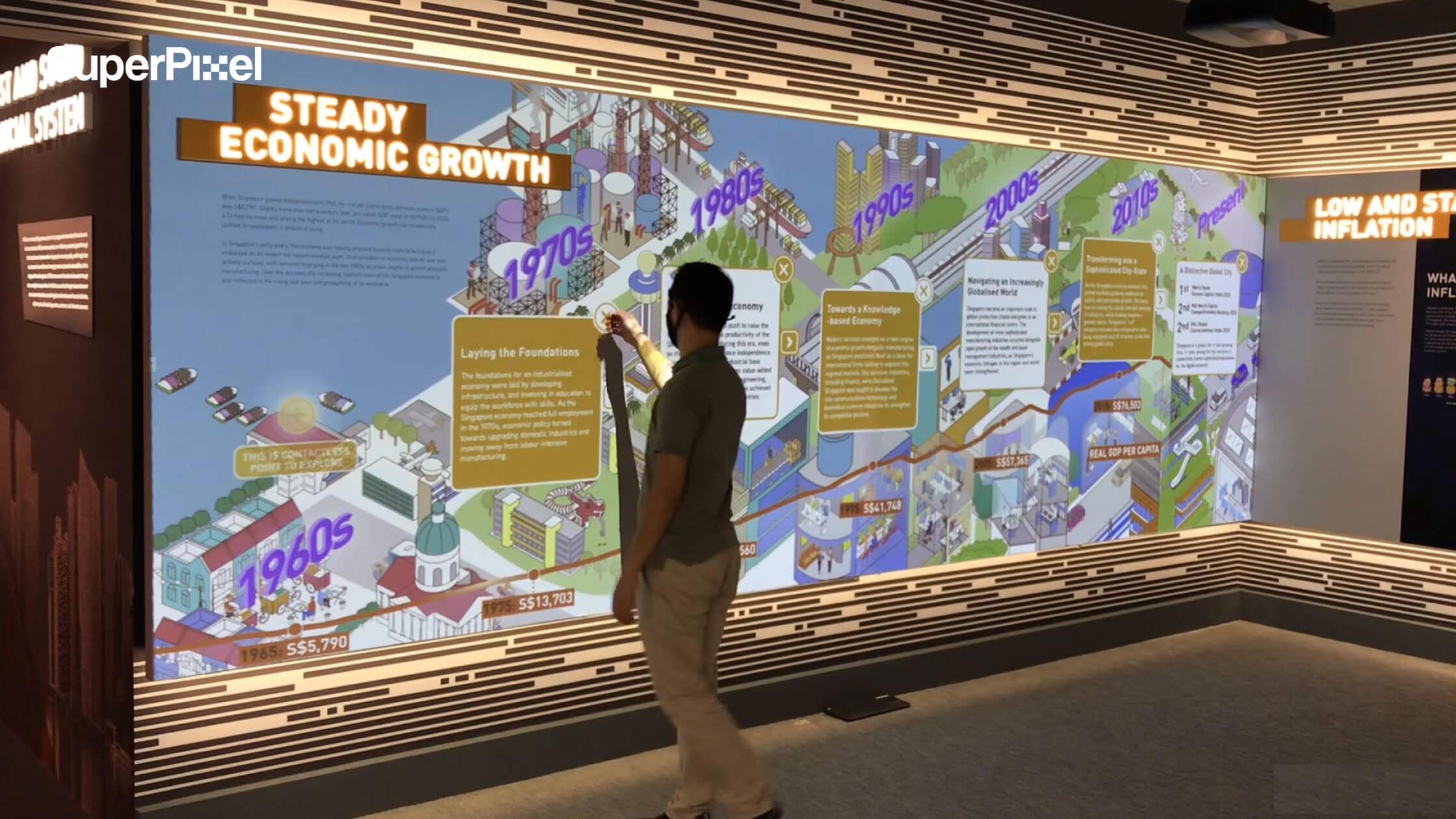
Singapore City Gallery | Interactive City Planning Experiences
For this project, SuperPixel helped revamp the gallery with interactive experiences that turn big planning questions into something visitors can explore hands-on.
Using game-like interactions and 3D environments, the gallery helps visitors understand:
- How transport choices shape Singapore’s future and why a car-lite society matters
- How Marina Bay could have evolved differently based on real planning decisions
- How trade-offs and long-term thinking sit behind the city we see today
Instead of telling visitors what to think, the experience lets them discover it themselves that making complex ideas easier to grasp, more engaging, and far more shareable.
3. Explain a Product or Service Clearly
One of the strongest use cases for animated infographic videos is product or service explanation.
When potential customers evaluate an offer, clarity matters. They need to understand:
- What the product does
- How it works
- Why it is relevant to their lives
An animated infographic delivers this in a structured, narrative format that supports decision-making without overwhelming the viewer.
SuperPixel x AIA | Absolute Critical Cover
In this project, SuperPixel used 2D animation to explain how an insurance plan benefits customers in everyday life.
The storytelling follows a main character through daily scenarios, illustrating:
- Risk situations
- Coverage protection
- Real-life relevance
The linear narrative keeps viewers engaged, while the infographic elements ensure the key information is delivered clearly and efficiently.
Best Practices for Creating Compelling Infographics
If the goal is a great infographic, not just a flashy one, here’s what matters.
1. Start With Narrative
To guide the reader, a narrative structure featuring a story arc with an introduction, body, and conclusion should be defined in interactive infographics.
Without structure, interaction feels random.
2. Use Progressive Disclosure
Progressive disclosure is a technique used in interactive infographics to reveal detailed information only when the user chooses to engage.
3. Limit Interactive Elements
Too many hotspots create noise. Interactive infographics require user interaction to initiate action, such as clicking or zooming in.
Make those actions meaningful.
4. Design for First Glance
The layout of an interactive infographic should be designed to present data in a way that is easy for the audience to consume.
5. Test Before Publishing
Testing and optimizing the interactive infographic before publishing is crucial to ensure all elements function as intended.
Broken hover states kill credibility fast.
Common Mistakes Teams Make
Even experienced teams fall into these traps:
1. No single key message. Trying to present everything leads to cognitive overload.
2. Overloading with dynamic content. Animations, audio, videos, all at once.
Interactive infographics can include clickable elements, animations, audio, and videos to enhance user engagement.
But they shouldn’t include all of them without reason. Restraint is design maturity.
Embedding, Sharing, and Measuring Performance
An interactive infographic should live beyond one page. The infographics can be embedded in websites and shared via unique links.
Interactive infographics can be embedded in various platforms, allowing for easy sharing and integration with other content. Embedding within blog posts increases dwell time.
Sharing via unique links supports campaigns. And users can track engagement metrics for their interactive infographics to measure effectiveness.
Measure:
- Time spent
- Click depth
- Completion rate
- Shares
Because design without measurement is guesswork.
Final Thoughts: Why the Interactive Infographic Is Here to Stay
An interactive infographic turns complexity into structured understanding. It helps marketers present layered data without overwhelming audiences. It makes ideas navigable, memorable, and easier to trust.
Strong results depend on disciplined storytelling and hierarchy. Pacing, progressive disclosure, and thoughtful testing shape clarity. Each interaction must serve intent, not distract attention.
It takes planning time, development effort, and accessibility consideration. Done carelessly, interaction creates noise instead of meaning. Done well, it earns sustained attention and credibility.
Your Next Step
Choose a partner who understands craft, not just tools. Execution requires alignment, workflow clarity, and shared intent.
SuperPixel approaches projects as creative partners, not vendors. If you’re ready to create an interactive infographic with purpose, contact SuperPixel to begin the conversation.
We align to brand, manage workflow carefully, and protect quality throughout.